Button 사용법
| 버튼 종류 |
설명 |
| Button |
기본 버튼 |
| OutlinedButton |
테두리만 있는 버튼 |
| TextButton |
배경 없이 텍스트만 표시되는 버튼 |
| IconButton |
아이콘만 표시되는 버튼 |
| FilledTonalButton |
기본 버튼보다 연한 색상의 버튼 |
| ElevatedButton |
그림자가 있는 입체적인 버튼 |
기본 사용법

Button(
    onClick = { /* 클릭 이벤트 */ }
) {
    Text(text = "기본 버튼")
}
속성 정리
- modifier (크기 조정)
- Modifier.size() 사용 (가로, 세로 크기 직접 지정)
Button(
    onClick = { /* 클릭 이벤트 */ },
    modifier = Modifier.size(150.dp, 50.dp) // 가로 150dp, 세로 50dp
) {
    Text(text = "고정 크기 버튼")
}
- Modifier.width() 및 Modifier.height() 사용 (가로, 세로 개별 조정)
Button(
    onClick = { /* 클릭 이벤트 */ },
    modifier = Modifier
        .width(200.dp)  // 가로 길이 조정
        .height(60.dp)  // 세로 길이 조정
) {
    Text(text = "가로 200dp 버튼")
}
- Modifier.fillMaxWidth() 사용 (가로 전체 확장)
Button(
    onClick = { /* 클릭 이벤트 */ },
    modifier = Modifier.fillMaxWidth() // 부모 요소의 가로 크기만큼 확장
) {
    Text(text = "가로 전체 버튼")
}
- Modifier.fillMaxSize() 사용 (가로 & 세로 전체 확장)
Button(
    onClick = { /* 클릭 이벤트 */ },
    modifier = Modifier.fillMaxSize() // 부모 요소 크기 전체를 차지
) {
    Text(text = "전체 크기 버튼")
}
- Modifier.padding() 사용 (버튼 내부 여백 조정)
Button(
    onClick = { /* 클릭 이벤트 */ },
    modifier = Modifier
        .width(180.dp)
        .height(50.dp)
        .padding(8.dp) // 버튼 주위에 8dp 여백 추가
) {
    Text(text = "패딩 추가 버튼")
}
- contentPadding 속성 사용 (버튼 내부 여백 조정)
Button(
    onClick = { /* 클릭 이벤트 */ },
    contentPadding = PaddingValues(16.dp) // 버튼 내부
- enabled (비활성화)

Button(
    onClick = { /* 클릭 이벤트 */ },
    enabled = false // 버튼 비활성화
) {
    Text(text = "비활성 버튼")
}
- colors (스타일 변경)

Button(
    onClick = { /* 클릭 이벤트 */ },
    colors = ButtonDefaults.buttonColors(
        containerColor = Color.Blue, // 배경색
        contentColor = Color.White   // 텍스트 색상
    )
) {
    Text(text = "색상 변경 버튼")
}
- shape (모양 변경)

Button(
    onClick = { /* 클릭 이벤트 */ },
    shape = RoundedCornerShape(12.dp) // 모서리 둥글게
) {
    Text(text = "둥근 버튼")
}
- border (테두리 추가)

Button(
    onClick = { /* 클릭 이벤트 */ },
    border = BorderStroke(2.dp, Color.Red) // 테두리 추가
) {
    Text(text = "테두리 버튼")
}
Button 종류벌 정리
- OutlinedButton (테두리만 있는 버튼)

OutlinedButton(
    onClick = { /* 클릭 이벤트 */ }
) {
    Text(text = "OutlinedButton")
}
- TextButton (텍스트만 있는 버튼)

TextButton(
    onClick = { /* 클릭 이벤트 */ }
) {
    Text(text = "TextButton")
}
- IconButton (아이콘만 있는 버튼)

IconButton(
    onClick = { /* 클릭 이벤트 */ }
) {
    Icon(Icons.Default.Favorite, contentDescription = "좋아요", tint = Color.Red)
}
- FilledTonalButton (연한 색상 버튼)

FilledTonalButton(
    onClick = { /* 클릭 이벤트 */ }
) {
    Text(text = "FilledTonalButton")
}
- ElevatedButton (그림자가 있는 버튼)
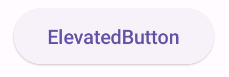
ElevatedButton(
    onClick = { /* 클릭 이벤트 */ }
) {
    Text(text = "ElevatedButton")
}